How Better Charts Can Lead to Better Business Calls
Narima Digital •

Data is everywhere. But when it’s scattered across spreadsheets, reports, and dashboards, it can feel more like noise than insight. That’s where data visualization changes the game. Instead of staring at numbers, you start seeing patterns. Instead of guessing, you start knowing.
If your team is trying to make smarter decisions and stay ahead, turning raw data into visual stories is one of the fastest ways to get there. And when we talk about data visualization for business insights, we’re not just talking about pretty graphs. We’re talking about clear, strategic decisions backed by real-time understanding.
Why Visualization Beats Raw Data Every Time
Reading a data table with hundreds of rows? That takes time. Spotting a spike in a line chart? That’s instant.
Visualization helps you:
- Spot trends and outliers fast
- Understand relationships between different data points
- Communicate ideas more clearly with your team
- Make confident decisions backed by what’s actually happening
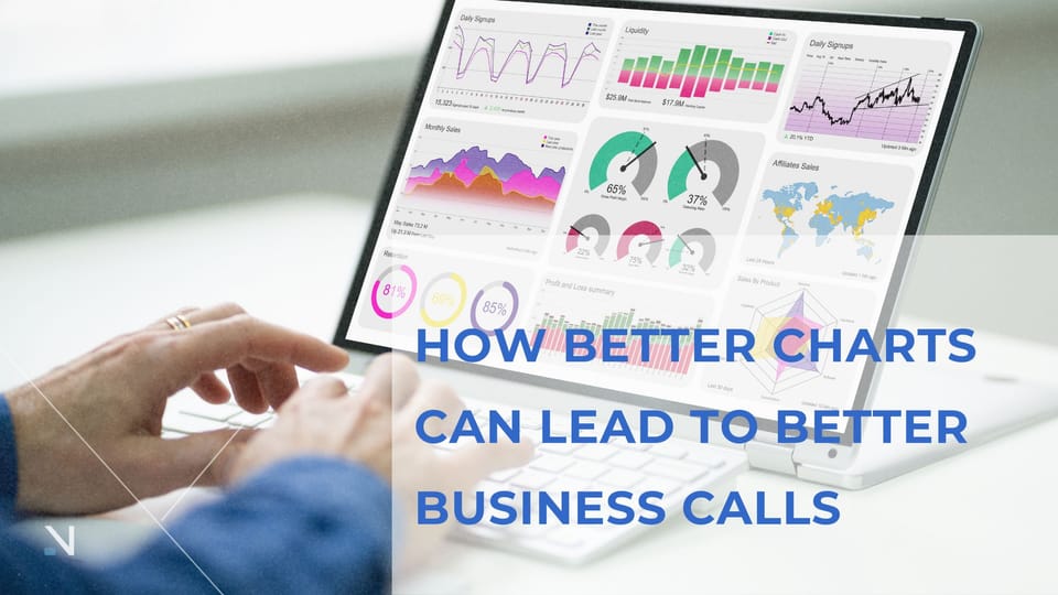
Whether it’s a dashboard showing daily sales performance or a heatmap of customer drop-offs, visual tools help your entire team get on the same page quicker.
Strategic Decisions Start with Clarity
Think about the last big decision your business made. Was it based on clear, visual data or a feeling that something needed to change?
When leaders rely on charts and dashboards instead of gut instinct, the results speak for themselves. You can identify what products are performing, where customers are getting stuck, or which marketing campaigns are worth the spend.
And when it’s time to present that strategy to stakeholders? Showing a simple bar graph can often be more convincing than paragraphs of explanation.
Bring Your Data to Life with the Right Tools
Not all visualizations are created equal. The best ones are easy to read and built for action. Tools like Tableau, Power BI, and Looker allow you to build dashboards that update in real time and reflect exactly what your business needs to track.
Choose visuals that:
- Align with your business goals
- Are easy for your team to interpret at a glance
- Drive specific actions or decisions
Want to see more about how visuals help teams work smarter? You’ll enjoy our related article on how analytics can propel your business forward. It digs deeper into the types of charts and use cases that can change the way you operate.
Use Cases That Make a Real Difference
Data visualization isn’t just for marketing reports. Here’s where it’s really making an impact:
1. Sales Performance
Track progress, forecast revenue, and identify your top performers.

2. Customer Behavior
Understand where customers drop off and what actions lead to conversions.

3. Financial Planning
Keep an eye on budgets, spending trends, and ROI across departments.
4. Project Management
Visualize workloads, track progress, and highlight risks early.
5. Executive Dashboards
Get an overview of key metrics in one place without diving into the details.
When you visualize your data, you give your business a clearer path forward. No more guessing. No more scattered reports. Just visual clarity that drives real decisions.
At Narima, we help companies build dashboards that do more than just display data. They uncover stories, support strategy, and move your business in the right direction. Let’s build visual tools that make your next decision a confident one.


