Data Visualization Techniques Every Business Leader Should Know
Narima Digital •
In today’s data-driven world, business leaders have access to more information than ever before. But raw data on its own doesn’t provide much value—it’s how you interpret and present it that makes the difference. Data visualization turns complex datasets into clear, impactful insights, helping businesses make better decisions, identify trends, and communicate findings effectively.
The challenge? Not all data visualizations are created equal. A cluttered chart or a misrepresented graph can lead to confusion rather than clarity. That’s why mastering the right data visualization techniques and tools is crucial for every business leader. Here’s how you can use visual data representations to drive smarter business decisions.
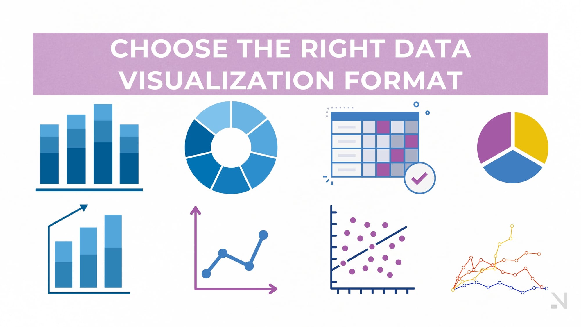
1. Choosing the Right Data Visualization Format
Different types of data require different visualization methods. Selecting the right one ensures that your audience understands the message you’re conveying.
Bar Charts: Ideal for comparing different categories of data, such as sales performance across different regions.
Line Graphs: Best for showing trends over time, such as monthly revenue growth or customer acquisition.
Pie Charts: Useful for illustrating proportions, like market share distribution or budget allocations.
Scatter Plots: Great for identifying correlations between two variables, such as advertising spend vs. customer conversions.
Heat Maps: Helpful for visualizing large datasets with patterns, such as website user activity or product sales per region.
Tip: Avoid overwhelming your audience with too many visuals. Keep it simple and focused on what matters most.
2. Leveraging Business Dashboards for Real-Time Insights
A business dashboard is a centralized platform that consolidates key metrics and insights in an easy-to-read format. Instead of sifting through spreadsheets, leaders can access critical data at a glance.
Key elements of an effective business dashboard:
Customization: Tailor dashboards to specific business needs (e.g., sales performance, operational efficiency, marketing analytics).
Interactivity: Enable users to drill down into data for deeper insights.
Real-time Data Updates: Keep decision-makers informed with live data streams.
Data Filters: Allow segmentation of data by time period, location, or department.
Popular Business Dashboard Tools:
Tableau: A robust tool for interactive and dynamic data visualization.
Google Data Studio: A free platform for integrating and visualizing business data.
Power BI: A Microsoft-backed tool that integrates seamlessly with existing business software.
Looker: Ideal for data exploration and analysis, particularly for SaaS companies.
Tip: Choose a dashboard tool that integrates with your existing data sources, ensuring seamless reporting and real-time accuracy.
3. Enhancing Storytelling with Data
Numbers alone won’t persuade your audience. Business leaders need to present data in a way that tells a compelling story.
How to Craft a Data Story:
Start with a Business Question: What are you trying to answer? Example: Why are sales declining in Q2?
Find the Most Relevant Data: Use filters to focus on key metrics rather than overwhelming details.
Use Clear Visuals: Opt for graphs that highlight key takeaways rather than distract with unnecessary information.
Provide Context: Explain what the data means and how it connects to business goals.
End with Actionable Insights: What should the business do next based on the findings?
Tip: Avoid using excessive jargon—data should be digestible for everyone, not just analysts.
4. Avoiding Common Data Visualization Mistakes
Even the best tools can’t compensate for poor visualization choices. Here are the most common pitfalls to avoid:
Overcomplicating Charts: Keep it simple. Too much detail makes data hard to interpret.
Using the Wrong Chart Type: Ensure the visual format matches the type of data being displayed.
Ignoring Data Accuracy: Always double-check sources and calculations to prevent misleading insights.
Lack of Context: Data without context can be misleading. Always explain why a metric matters.
Tip: Test your visualizations with colleagues before presenting them to a wider audience to ensure clarity and impact.
5. The Future of Data Visualization
As businesses become more data-driven, the landscape of data visualization is evolving. Emerging trends include:
AI-Powered Analytics: Automated insights that highlight patterns and anomalies in data.
Augmented Reality (AR) & Virtual Reality (VR) Visualizations: More immersive data storytelling experiences.
Voice-Activated Dashboards: Hands-free data queries for faster decision-making.
Predictive Analytics Visualizations: Charts that not only show past performance but also forecast future trends.
Tip: Stay ahead by exploring new visualization methods that enhance decision-making efficiency.
Turn Data Into Actionable Insights
Data visualization isn’t just about making reports look pretty—it’s about transforming raw data into actionable business intelligence. The right techniques and tools enable business leaders to identify trends, uncover insights, and drive strategic decision-making with confidence.
At Narima, we help businesses unlock the power of data through custom dashboards and visualization strategies tailored to their goals. If you’re ready to elevate your data-driven decision-making, let’s talk. Get in touch today and take control of your business insights!